When you think of the sexiest, most exciting categories of products to talk about, project management software is always near the top of the list.
Right?
OK fine, how we manage projects isn’t an inherently fun topic. In fact, it’s probably one of the driest, most function-focused concepts out there. The whole point of this category is to help you work better at work.
Hard not to yawn a little when you read that.
Despite the low excitement factor, we all know it addresses a critical pain point. Whether you’re a team of one or many, you can’t do great work without tools to stay on track. When work isn’t organized, your efficiency drops and your days are filled with stress, anxiety, and frustration.
This is what makes it a perfect target for a messaging teardown.
When offering super functional products, how do these companies avoid the trap of leading with features. How do they tap into the emotional benefits for their customers?
The following is a teardown of how these companies market to their target audiences. Let’s see what they’re doing well and where there’s opportunity to improve.
The Grades
The primary meter we focus on goes from a low-end of speaking to “Function & Features” to the high-end of speaking to “Emotion & Benefits”.

Despite our love of dissecting features, our emotions are what really drive our decision making. A great marketing message doesn’t rely on the customer to translate how a particular product or feature might solve a problem for them. Instead, the message cuts straight to the point and talks about benefits.
That’s how we’ll grade each of the messages of these companies.
Note, this isn’t meant to compare the actual quality of features or differences of the products themselves. This is strictly taking the marketing messages at face value.
The screenshots we analyzed are what was live on each company’s website as of the writing of this article.
Basecamp
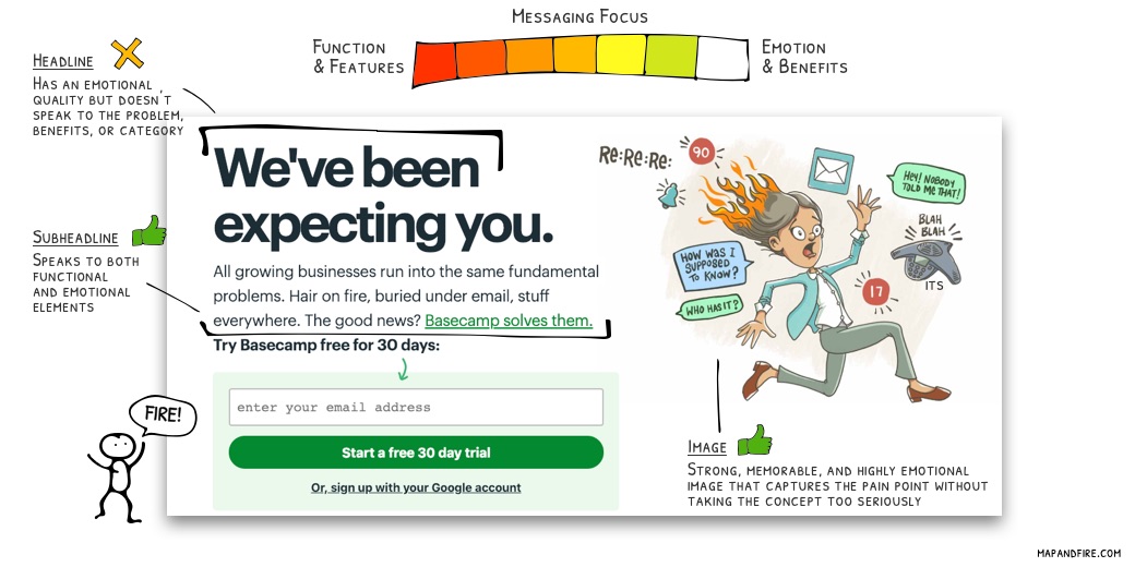 Remember that earlier line about the stress and anxiety you get when work goes off the rails?
Basecamp does an excellent job here of focusing first and foremost on emotional needs. They touch a little on the functional problems, but don’t even bother with the features they provide to solve them.
Message critiques:
- The headline provides almost no value. It doesn’t speak to the problem, the benefits, or the category.
- While the emotional factor is maxed out, it focuses almost exclusively on the problem. The only talk of benefits is an abstract notion of “we solve this”.
The project management space is largely about pain-prevention, so this may be a case where users would respond as well to identifying pain over benefits.
But it would be interesting to use that valuable headline space for something that connects back to high level benefits, like:
“A bucket of water when your hair’s on fire.”
Trello
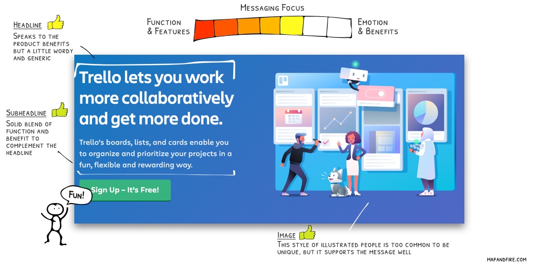
Trello provides a prime example of the opposite emotional approach. They’re all about positive benefits and emotion.
This approach paints a clear picture of how their users’ lives will improve. They also use an illustration style that’s become overly popular in the software space lately. The benefit being that it creates a more abstract view of user types to avoid excluding specific demographics.
Message critiques:
- It’s not necessary to repeat the brand name 3 times (headline, subheadline, and logo above). The headline would be cleaner and punchier as: “Work more collaboratively and get more done.”
- The benefits are too generic. It would be great to see a headline that alludes to the benefits and style specific to Trello.
Because Trello uses a kanban style board where you move tasks along stages of a funnel, maybe an alternate could be:
“You’ve never seen your work flow like this.”
Note the dual play on “work flow” and “workflow”. #nailedit.
Asana
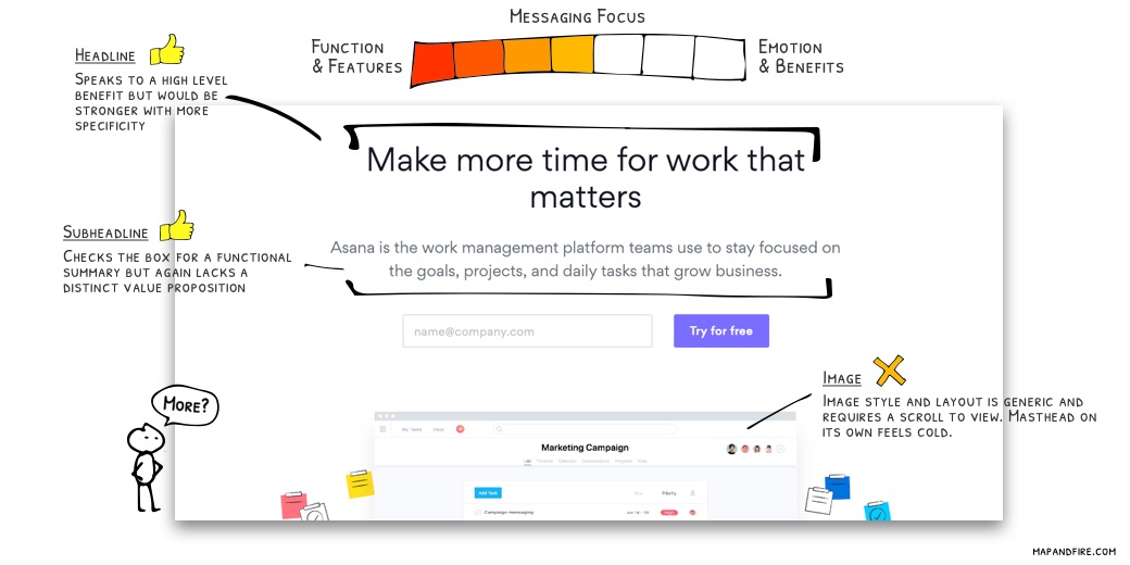
On the plus side, Asana makes an effort to speak to a high level benefit: “Make more time”. The promise here is that you’ll be more efficient so that you can focus on high level thinking and less on low level tasks.
Cool.
The downside is that in an effort to be clean and simple, the brand is left without any unique qualities. There’s nothing here to capture my attention or help me distinguish them within the competitive space.
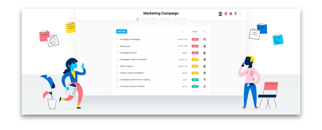
They again have a safe variation on abstract people illustrations:
Message critiques:
- Instead of a vague abstraction of “work that matters” try to get a little more specific. Don’t force the user to do the mental heavy lifting of what that means.
- Avoid all the “work” talk. Project management isn’t an exciting space, so inject some personality to counterbalance that dryness.
If the focus is on time for important tasks, an alternate could be:
“Spend more time creating and building.”
Flow
I’ve used Flow in the past and even helped onboard it for an entire agency where I used to work. The product itself was very solid.
But this marketing is very forgettable.
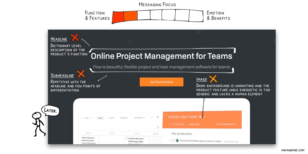
Everything here focuses on basic functional descriptions without any signs of differentiation. The brand presents very clean, but too dark and basic. The demo video below has energy but there’s nothing here that speaks to why Flow is unique or how it will make my life better.
If I was in the market for a project management tool and looked at a bunch of options back-to-back there’s no chance I would be able to remember Flow.
Message critiques:
- A total lack of appeal to emotion or benefits here. Don’t provide a dictionary definition for users, explain what they’ll get out of their investment.
- The subheadline literally repeats 4 of the 5 words in the headline (project, management, for, teams). Use the headline to speak to the unique benefits, and let the subheadline provide functional support.
The only interesting word in the messaging here is “beautiful”. That’s certainly not a word most people would associate with project management software. So, if that’s part of the value proposition, then focus on it as a differentiator.
An alternate could be:
“Managing your work should feel and look great.”
Summary
There’s no doubt these companies have all tested out variations of messages over the years to help them arrive at this point. Something about what they’re doing works.
The point is less about proving objectively how effective they are and more about showing the lessons we can learn from their approach. There’s always room to try new angles and improve connections with customers.
There are a lot of factors to consider when writing your own messaging, but it’s always good to keep in mind that:
- Customers will judge you first and foremost based on their emotions.
- It’s your job to translate the features of your offerings into actual benefits for your customers. Don’t make them figure it out on their own.
Write Better Marketing Messages
If you want help crafting and optimizing effective marketing messages, try out our product, StratPack.
Try StratPack for free.
Enough chitchat, see for yourself!
We’re always happy to answer questions about StratPack, but the best thing you can do is try it for yourself. Lucky for you, it’s totally free to get started, so give it a shot and see how fast and easy it is to create great messaging!

